
3 Common Mistakes in Large Format Printing (and How to Avoid Them)
April 20, 2020
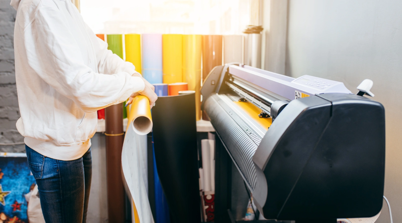
Large format printing is a common way to get your message across, but even with its popularity, there are still tons of mistakes that could be made throughout the design and printing process. Before you embark on a journey to get your banner or display printed, you’ll want to make sure your design is in tip-top shape. Check out below to learn the three most common mistakes made in large-format printing so you can avoid them altogether for a beautifully designed and printed piece.
Why does Large Format Printing Quality Matter?
Large format printing quality influences on the overall impact and perception of the printed material. When the printing quality is high, the visuals are crisp, vibrant, and true to the intended design. This attention to detail enhances the professional image of the content, making it visually appealing. A polished and clear visual presentation not only grabs attention but also effectively conveys the intended message or information.
Poor quality large format printing can result in blurred or pixelated images, color inconsistencies, and an unprofessional appearance, diminishing the credibility and efficacy of the message being communicated. Avoiding common large format printing mistakes is crucial for creating a positive impression and effectively communicating messages to the audience.
3 Things to Avoid in Large Format Design
1. Not Considering Perspective
The Mistake
You want to get your entire point across in one cohesive piece. However, sometimes too much information can be harmful. Consider perspective when designing a large format print piece. Can the person 100 feet away get the same information as the person standing right in front of it?
Failing to consider perspective means neglecting how the design will appear from different viewing angles and distances. It can result in distorted or disproportional visuals when the image is enlarged for printing.
Importance of Avoiding this Mistake
Proper consideration of perspective is crucial to ensure that the design maintains its intended impact and visual appeal when viewed by the audience. Neglecting perspective can lead to a lack of harmony and coherence, detracting from the overall message and quality of the printed material.
How to Avoid
Use design software that allows for precise scaling and adjustments. Preview the design at different scales to ensure it maintains its intended look from various viewing distances. Conduct thorough testing to verify the design’s appearance and perspective alignment.
2. Less than Ideal Color Choices
The Mistake
Choosing inappropriate colors or failing to ensure color accuracy can result in a final print that differs significantly from the intended design. This includes issues like color mismatches, imbalances, or colors that do not resonate well with the target audience. For example, bright colors on light backgrounds are not ideal, nor are two dark colors. The words will blur into the background from far away
Importance of Avoiding this Mistake
Colors are a vital aspect of design, influencing emotions, conveying messages, and impacting brand perception. Incorrect color choices can lead to a design that fails to engage the audience effectively, diminishing the design’s overall effectiveness and potentially causing confusion or misinterpretation.
How to Avoid
Use a color management system to ensure accurate color representation. Choose colors based on your brand guidelines, target audience preferences, and the intended message. Always conduct color tests and proofing to confirm that the selected colors appear as intended in the final print.
3. Poor Image Quality
The Mistake
The perfect image for your brand or message isn’t always the perfect imaging for large format printing. Including low-resolution or poor-quality images can result in pixelation, blurriness, or lack of sharpness in the final printed output, especially when enlarged for large format printing.
Importance of Avoiding this Mistake
Image quality directly impacts the overall visual appeal and professionalism of the printed material. Low-quality images can compromise the design’s integrity, making it look unprofessional and potentially undermining the message you’re trying to convey.
How to Avoid
Use high-resolution images (at least 300 dpi) suitable for enlargement without loss of detail. Verify image quality and resolution before incorporating them into the design. Replace or resize images that do not meet the required quality standards for large format printing. Always prioritize image clarity and sharpness for a polished final print.
Work with Bestype for Your Large Format Printing
Large format printing mistakes can be easy to make, especially if you don’t have much experience with large format printing. That’s why working with experts from Bestype can make your project go much smoother. Contact us to find out how we can help with your large format printing project.