
The Power of White Space in Design
April 20, 2020
Sometimes, less is more. That saying applies to business cards design too.
White space can say more about you or your business. White space is usually connected with sophistication, while busy designs signal cheap. This is why traditional business cards focus on basic text with a few engaging graphical designs.
However, unique brands and professionals can also benefit from white space. People working for luxury brands or businesses need a card that is concise and unique. Utilizing white spaces creates these lasting impressions for New York networking.
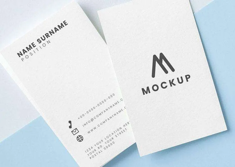
White spaces, blank spaces or negative spaces are the areas in design that are not occupied by images or text. Either way, it does not mean these spaces are all white. The term white space refers to the space itself.
Few mast this critical design element. Most people want to fill space on their business cards just because they have it. Hence, white space on a business card creates a luxurious look.
White space is good for making sure your design is not too cluttered. A design that looks like sardines in a can will not help you stand out.
If your design does not have any white space, then you need to cut something out. At the very least, move it to the backside. For instance, you can place contact info on the back if you offer an elegant logo on the front.
Why do you need white spaces in business cards design?
White spaces reminds us that simple designs are effective. These modern and simple designs communicate that your business knows how to work efficiently. They can say more with a little. They do not have to oversell themselves.
Human instincts rely on less, which is why the human eye likes white space from close or far. This relaxing visual effect leaves a positive impression that will help you stand out at New York conferences or meetings.
Further, white space also increases readability. The recipient understands the text easily. Hence, they are more likely to remember you or your business during their busy day in NYC. You do not want to confuse a busy professional with too much text.
Added, white space creates a hierarchy. Each item should have a proportionate amount of white space around it. This helps recipients decide which facts to remember or leave in the background.
To increase white space in design, try picking the five most important pieces of information on the card. Then cut out everything else. The design will look way more fresh and elegant. You must keep your business cards fresh in New York.
White spaces communicate luxury and elegance
Think about it. Designer and luxury brands usually rely on white spaces. These communicate high quality. Don’t you want your NYC business card to communicate that too?
Ultimately, you do not want your connections to feel overwhelmed by your business card. This will leave a bad impression. Therefore, an elegant design focused on your logo communicates that a business card receipt only needs to focus on the trademark of your company.
When it comes to printing your luxurious business card you can trust the professionals at Bestype Imaging. If you live in New York, they can pair your white space business card design with the perfect paper size, shape, and type. Bestype Imaging can also help you find the printing style that fits your brand’s image.
Bestype Imaging also offers fast and affordable printing in the NYC area. More importantly, they can make sure you leave with a luxurious business card as soon as you need one.
Image Credit: Freepik @ Creative Commons